The pages customers buy through
All Products, the collections page, one product's page, the product cards, the cart, the checkout and the blog — the pages that carry the sale.
The pages here are not built out of sections — the shop makes them for you out of your products. What you choose is how they look. Each one has its own tile on the Design screen.
Take the walk yourself first
Before changing anything here, go to your own website and walk the whole path as a customer: shop page → one product → add to cart → cart → checkout. Whatever felt awkward on that walk is the page worth working on. Everything else can wait.
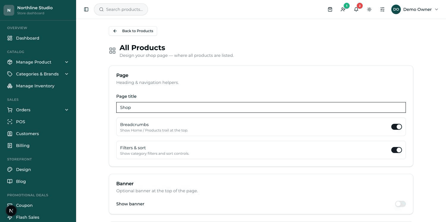
All Products — your shop page#
This is the page that lists everything you sell. For most shops it is the busiest page after the homepage.
- Page title — the heading at the top. Leave it as All Products or write your own, like "Everything in the shop".
- Breadcrumbs — the small Home / Products trail at the top that shows where the customer is.
- Filters & sort — the controls that let a customer narrow the list by category or reorder it. Worth keeping on once you have more than a few dozen products.
- Banner — turn Show banner on to put a picture strip with a Heading and Subtext at the top of the shop page.
- Card style — press Change to pick how each product box looks: Classic, Premium, Minimal or Food menu.
- Columns (desktop) — how many products sit in a row on a computer, from 2 to 5.
Press Save changes when you are done, then open your shop page and refresh.
Collections — browsing by category#
This is a separate page that shows your categories as picture cards, so a customer can pick a group first and then look inside it. There is not much to set: a Card design, and a Title and Subtitle for the page.
Product Detail Page — one product#
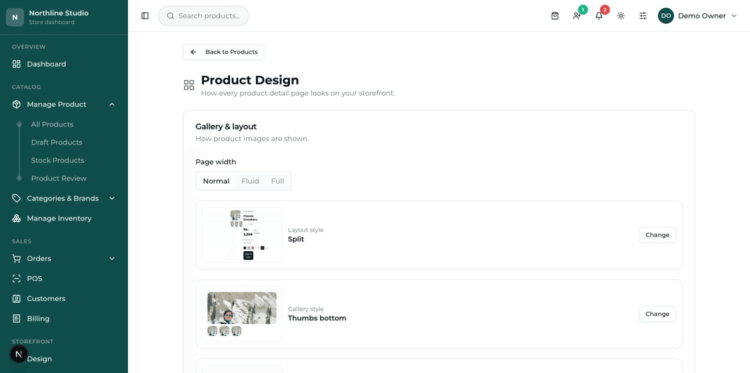
This is the page a customer opens after clicking one product, and it is where the decision to buy is actually made. Its screen is headed Product Design.
- Layout style — the overall arrangement of picture and words. Press Change to look through Split, Wide, Reversed, Stacked, Wellness, Luxury and Mosaic.
- Gallery style — how the extra photos are shown: small thumbnails under, to the left or right of the main picture, or a grid, or a slider.
- Image shape — Auto, Square, Portrait, Landscape or Tall. Square is the safest choice if your product photos are not all the same shape.
- Variant display — under Color style and Size style you choose how the colour and size choices look.
- Show on page — switches for Breadcrumbs, Rating, Description, Reviews and Tabbed layout (Description / Specs / Reviews).
- Further down there are cards for a banner, for short trust lines under the price, and for the feature blocks lower on the page.
Press Save changes, then open one of your own products and look.
Product Cards — the small boxes everywhere#
A product card is the small box with a photo, a name and a price that appears in every row of products. This tile does not change the card's design — it decides how colour and size choices show on it. That is one setting shared by every card in the shop.
- Show variants on cards — turn it off and colour and size only show on the product's own page.
- Popup — a small window opens when the customer adds to the cart, and they pick there.
- Card hover — the choices appear over the photo when the mouse rests on it. On a phone a small tap-button reveals them.
- After price — the choices are printed on the card, under the price. The most obvious, and the one that makes the card tallest.
Cart — the basket page#
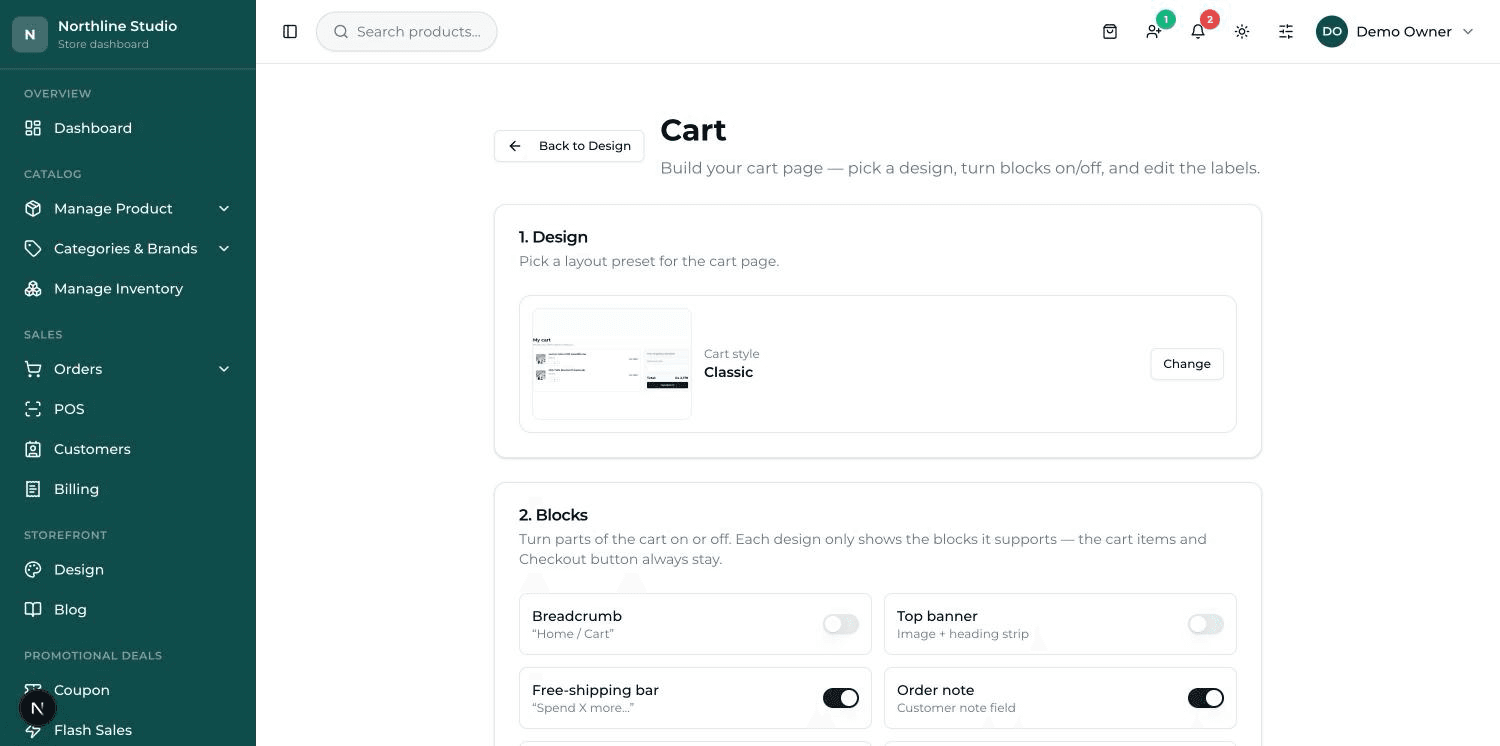
The cart is where a customer checks what they picked before paying. This screen has three cards, numbered in the order you should work through them.
- 1. Design — press Change and pick a layout: Classic, Table, Elegant, Minimal, Summary card, Luxury, Modern or Detailed.
- 2. Blocks — switch the extra parts on or off: Breadcrumb, Top banner, Free-shipping bar, Order note, Gift message, Discount code, Terms checkbox, Estimate shipping and Related / upsell products.
- 3. Text & labels — change the wording. Leave a box empty and the design's own default is used (you can see it greyed inside the box).
- Press Save. A green message says the cart design was saved.
Checkout — the last page#
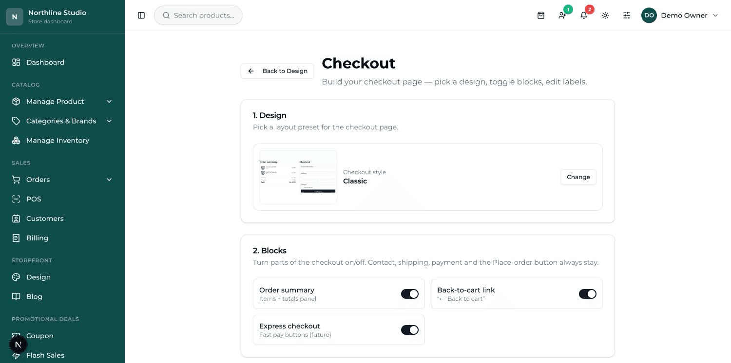
Checkout is where the customer types their address and pays. It is laid out the same way as the cart, with numbered cards.
- 1. Design — Classic, Invoice, Split, Stepped, Tabbed or Service.
- 2. Blocks — Order summary (the items and totals panel), Back-to-cart link, and Express checkout.
- 3. Text & labels — the summary heading, the form heading, and what the final button says.
- 4. Form fields — which boxes the customer has to fill in.
The checkout form fields#
In the card headed 4. Form fields, each row is one box on the checkout form. Every row has the wording on the left and two switches on the right — On, and Required.
- Full name, Phone, Street address and City are the core four. Their switches are fixed on — you cannot remove them, because without them a parcel cannot be delivered. You can still change what they are called.
- Postal / Zip code, Country and Company are ready and waiting, switched off. Turn on the ones you actually need.
- Add custom field makes a box of your own — a landmark, a WhatsApp number, a delivery instruction. Give it a name, pick what kind of box it is, and decide whether it is Required.
- The bin next to a custom field deletes it. Core fields have no bin.
Blog Display#
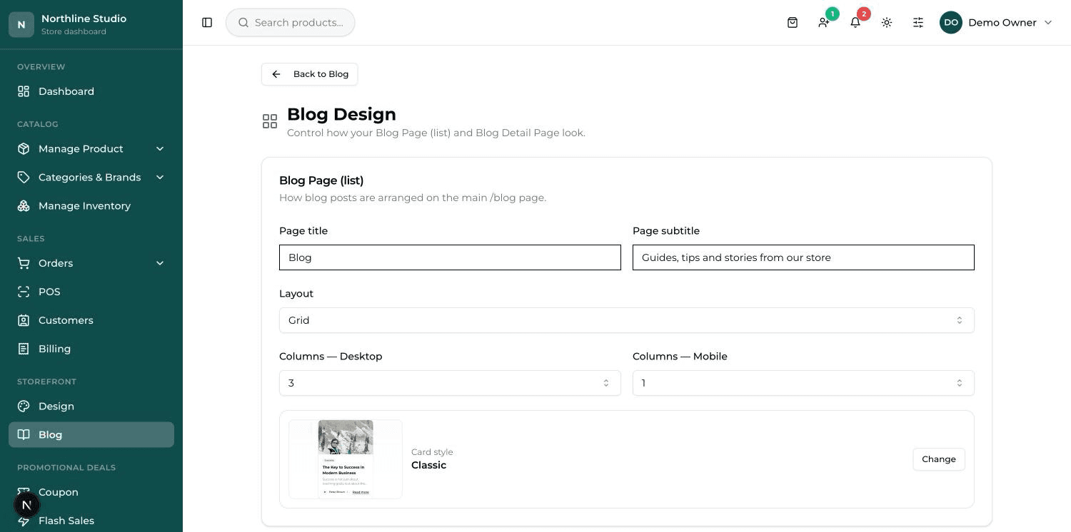
This tile, headed Blog Design, decides how your articles list and how one article reads. It does not hold the articles themselves — those are written under Blog in the menu.
- Blog Page (list) — the Page title and Page subtitle at the top, the Layout, Columns — Desktop and Columns — Mobile, and the Card style for each article box.
- Blog Detail Page — the Page style for reading one article (Centered, Hero or Magazine), the Content width, and switches for Author, Date, Reading time, Cover image, Breadcrumbs and Back to blog link.
- Blog Detail – Extras — Share buttons, an Author bio block with its own text, and Related articles with a heading and how many to show.
Press Save changes, then open your blog page and one article.