Your home page
Build the homepage out of blocks — add a block, pick its style, set its colours, put the blocks in order, and change the big banner pictures at the top.
What a section is#
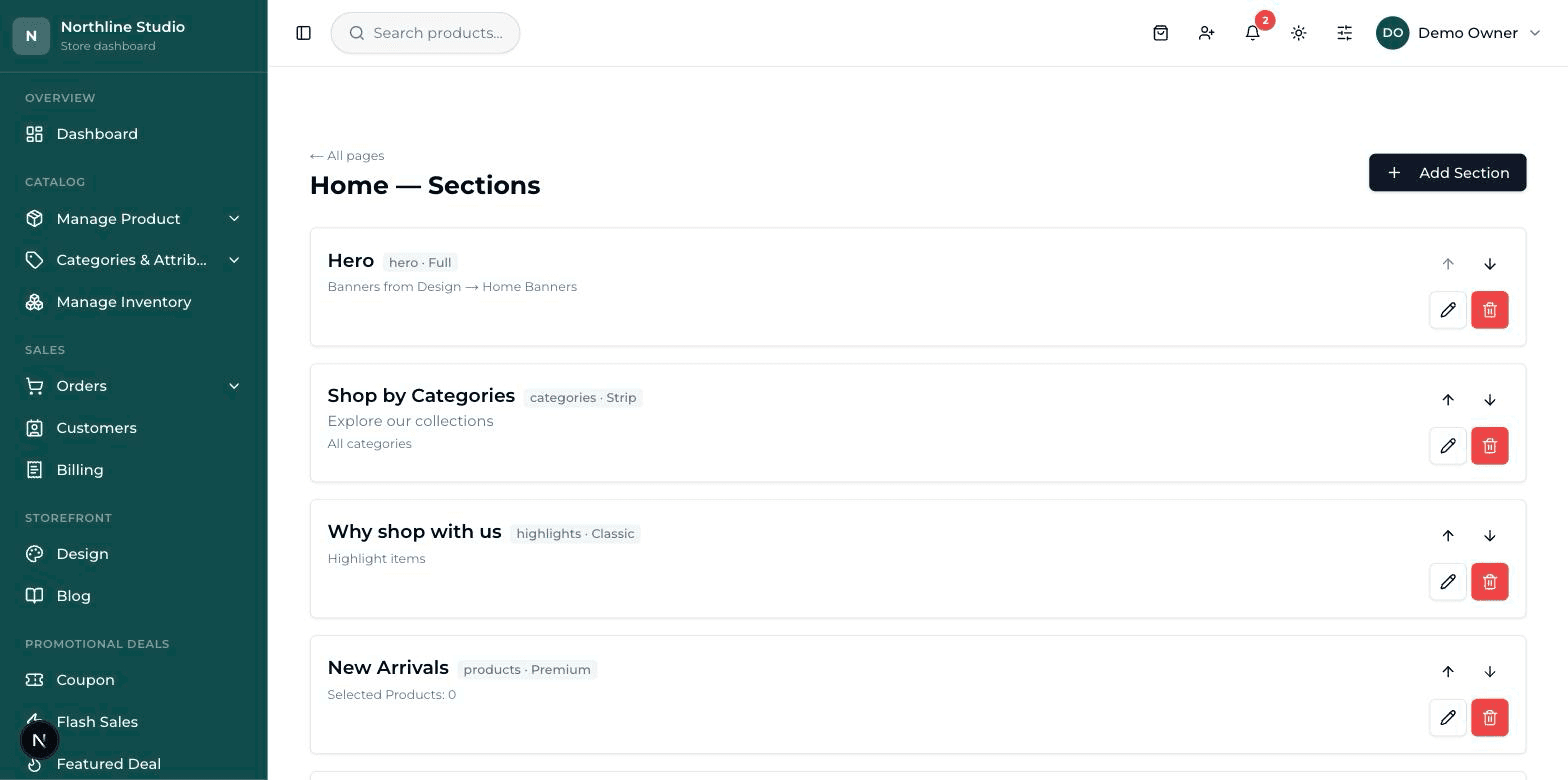
Your homepage is not one big picture. It is a stack of strips laid one under the other — a strip of banners at the top, then a row of products, then your categories, then a few short promises. Each strip is called a section. You add them, style them, and drag them into whatever order you like.
Sections are reached through the Pages screen, because every page of your website is built the same way.
Adding a section#
- On the Home — Sections screen, press Add Section at the top right.
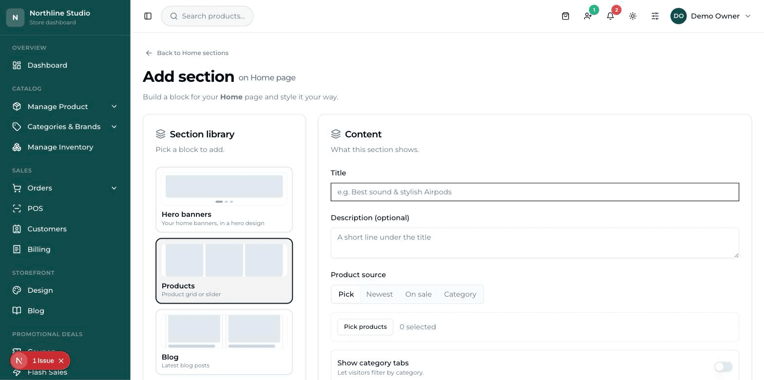
- A screen headed Add section opens, split in two. The left side is the Section library — the kinds of block you can add. The right side is the form you fill in.
- Click a block in the library — Products, for example. The form on the right changes to ask for what that block needs.
- Fill in the Title. This is the heading customers read above the block, like "New arrivals". The Description (optional) is a smaller line under it.
- Fill in the rest of the Content card, then look at the Design card underneath to choose how it looks.
- Press Create section at the bottom. A green message says the section was created and you land back on the sections list.
- Now open your website in another tab and refresh it. The new strip should be there.
The kinds of block in the library#
| Block | What it puts on the page |
|---|---|
| Hero banners | Your big top pictures. The pictures come from Home Banners; here you only pick their design. |
| Products | A row or grid of things you sell. |
| Blog | Your latest articles. |
| Highlights | Short promises with a small icon — free delivery, easy returns, and so on. |
| Categories | Your product groups shown as cards to browse by. |
| Hero | A heading, an image and a button — good at the top of an About page. |
| Rich text | Plain paragraphs of writing. |
| Text + Image | Writing beside a picture. You choose which side the picture sits on. |
| Contact form | A Name / Email / Phone / Message form visitors can fill in. |
| Map | An embedded Google map of your shop. |
| Team | Photos, names and roles of your people. |
| FAQ | Questions and answers customers keep asking. |
| Testimonials | What customers said about you, with a star rating. |
| Stats | Big numbers with a label — "10k+ happy customers". |
| Call to action | One headline and one button, to push people somewhere. |
| Feature slides | Dark slides with a round picture that change on their own. |
Choosing the design — the Change button#
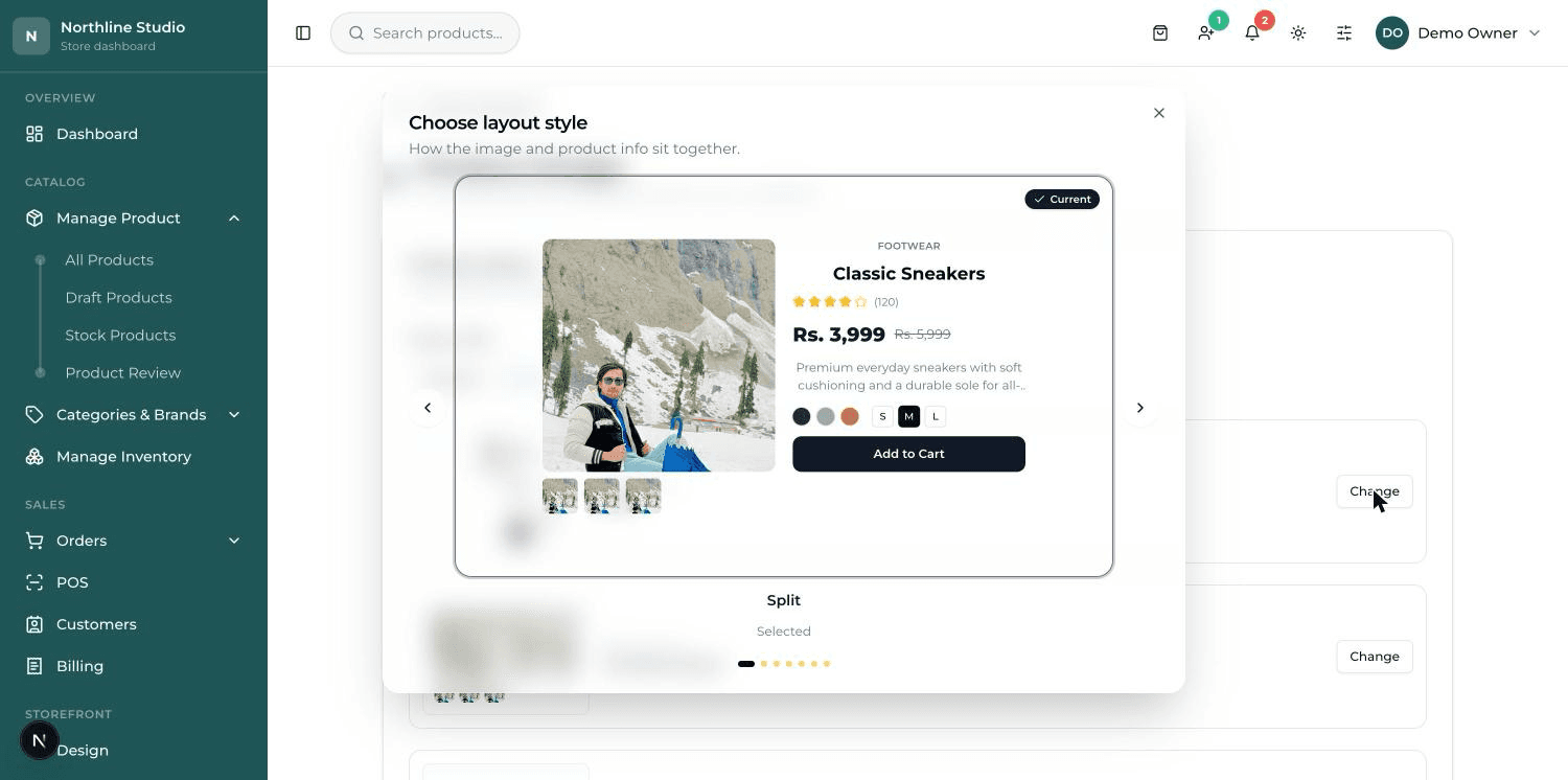
In the Design card you will see a small box with a picture, the name of the design you are using now, and a button that says Change. That one button is how every design in this dashboard is chosen — it works the same way on every screen.
- Press Change. A window opens showing one design at a time, big enough to judge.
- Use the arrows on the left and right to move through them. The dots underneath tell you how many there are.
- The one your shop is using now has a Current tag on it.
- Click the design you want. The window closes and the small box now shows your new choice.
- Press Create section or Update section at the bottom to save it.
Layout, width and columns#
Under the design chooser sit the controls that decide how much of the screen the block takes and how many things fit in a row.
- Layout — Grid lays the items out in neat rows. Slider puts them on a track the customer swipes sideways. Grid shows more at once; a slider saves height.
- Section width — Normal keeps it inside the page margins, Fluid stretches it wider, Full runs it edge to edge.
- Text alignment — whether the heading sits on the left, in the middle, or at the end.
- Columns — Desktop and Columns — Mobile — how many items sit side by side on a computer, and how many on a phone. Two are separate settings for a good reason.
Colours for one section#
Near the bottom of the Design card is Color scheme. This colours only this one strip of the page — nothing else moves.
- Light — the ordinary pale band. This is what most sections should be.
- Dark — a ready-made dark band, useful for making one section stand out from the ones above and below it.
- Custom — you choose each colour yourself: Background, Heading, Text, Price / accent and Tabs.
The "View all" button#
A Products or Blog section can carry a button under it that takes the customer to the full list. Two boxes control it.
- "View all" button text — what the button says. Write whatever you like: "See everything", "Shop all shirts".
- "View all" button link — where it goes. Leave it empty and it goes to your shop page for products, or your blog page for articles.
Putting the sections in order#
- On the Home — Sections list, use the up and down arrows on the right of each section to move it.
- As soon as you move one, two new buttons appear at the top: Save Order and Cancel.
- Press Save Order. A green message says the order was saved.
A sensible order for a homepage
Banners at the top, then your categories so people can find their way, then a row of products, then your short promises, then anything else. Put the thing you most want sold nearest the top — most visitors never reach the bottom.
Removing a section#
- Press the red bin button on the right of the section.
- A box asks you to confirm and names the section, so you can check you picked the right one.
- Confirm. The section is gone from the list.
Home Banners — the big pictures at the top#
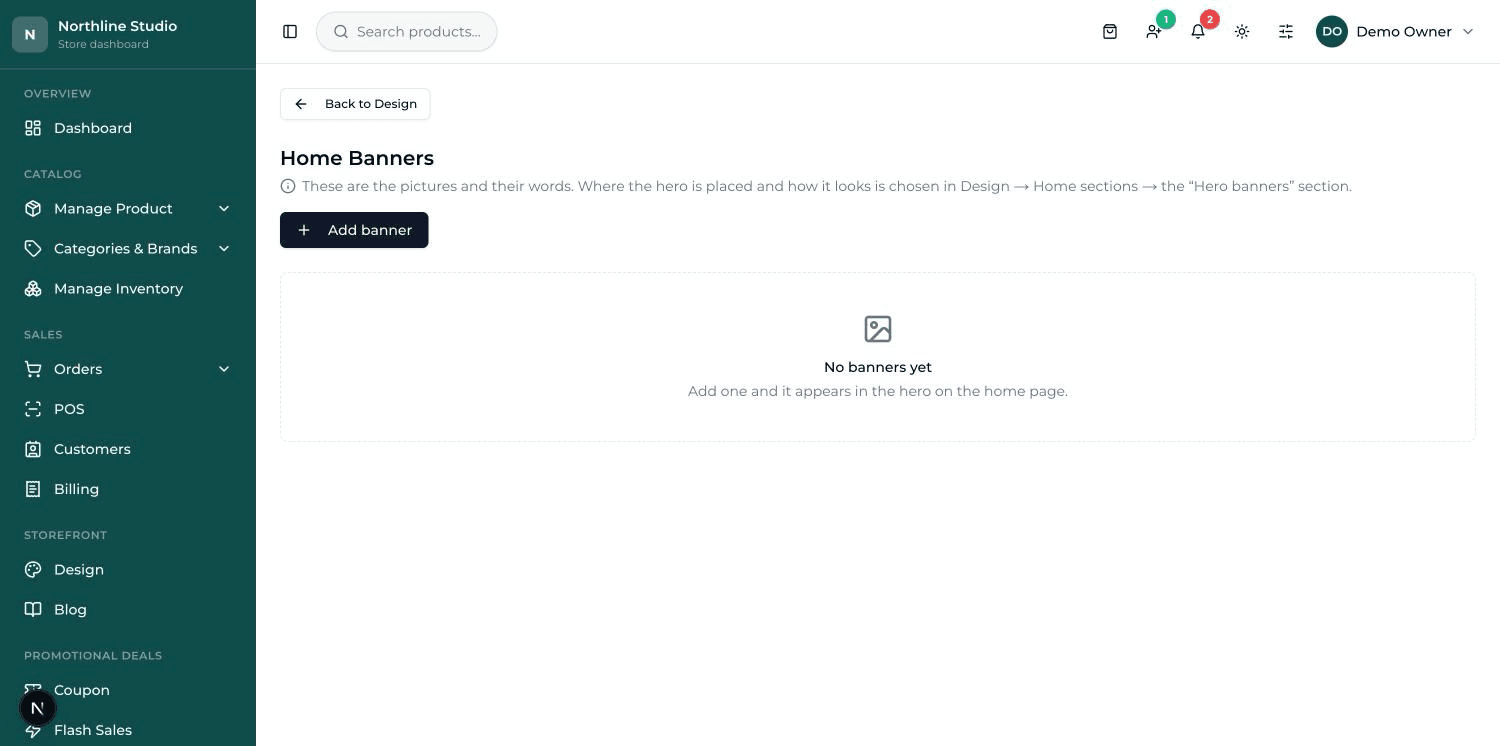
The big pictures across the top of your homepage are called banners. If there is more than one, they change one after the other on their own — that is what a slider is. The pictures and their words are set on their own screen.
- Press Add banner. A form opens headed New banner.
- Under Pictures, upload your wide picture into Desktop picture (required).
- Upload a taller picture into Phone picture (optional). This is worth the trouble — see the warning below.
- Fill in Heading — the big words on the picture. Subheading is the smaller line under it, and Caption a smaller line still.
- In Button text write what the button should say ("Shop now"), and in Button link where it should go ("/products").
- Whole-banner link makes the entire picture clickable. Leave it empty and clicking the picture takes people to your products page.
- Set Text position (Left, Center or Right) and Text colour (Dark text for light pictures, Light text for dark ones).
- Drag Overlay until the words are easy to read. It lays a thin shade over the picture.
- Look at the Preview and press Phone to see how it sits on a phone.
- Press Create banner. A green message says the banner was created.
Where the banner's design is chosen#
This trips people up, so it is worth being clear. The Home Banners screen holds the pictures and their words. It does not hold their design. The design — whether the banner is a full picture, split with text beside the product, boxed, minimal or a text card — is chosen in the Hero banners section on your Home page.
In that same place you also set Slider — how visitors move from one banner to the next: dots below, dots on the right, or a fade with arrows.