Colours, lettering, menu and footer
The four settings that touch every page at once — Theme & Colors, Typography, Navigation and the Footer builder.
Theme & Colors#
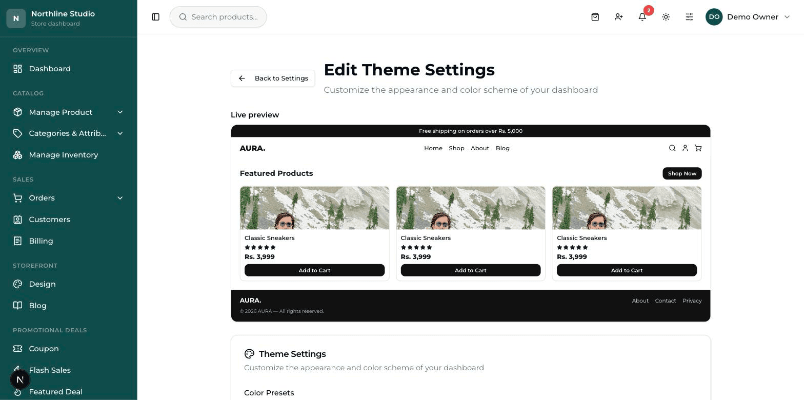
At the top of this screen is a Live preview — a small model of your shop that changes colour as you change the boxes below. Use it, but still open the real website afterwards.
- Scroll to the block headed Website Colors. This is the one that changes your live shop — the rows above it are for the general theme.
- Click the small coloured square next to a name to open the colour picker, or click one of the ready-made swatches under it.
- Watch the Live preview at the top change as you go.
- Press Update Settings at the bottom (it says Save Settings the first time). A green message confirms it.
- Open your website and refresh. The new colours should be there.
Which colour lands where#
| Setting | What it paints |
|---|---|
| Topbar Background / Topbar Text | The thin strip right at the very top of the website, where an announcement can sit. |
| Header Background / Navbar Text / Links | The band with your logo and menu, and the colour of the menu words. |
| Sticky Header Background / Sticky Header Text | The same band once the customer scrolls down and it sticks to the top. |
| Buttons Background / Buttons Text | The main buttons across the shop — Add to cart, Checkout, and the rest. |
| Footer Background / Footer Text | The strip at the very bottom of every page. |
Button Style#
- Filled — a solid coloured button. The safest choice, and the one people notice most.
- Outline — just an outline with no fill inside. Quieter, suits a plain, upmarket look.
- Text + Underline — no box at all, only the words with a line under them. The quietest of the three; use it only if your shop is otherwise very plain.
Typography — the lettering#
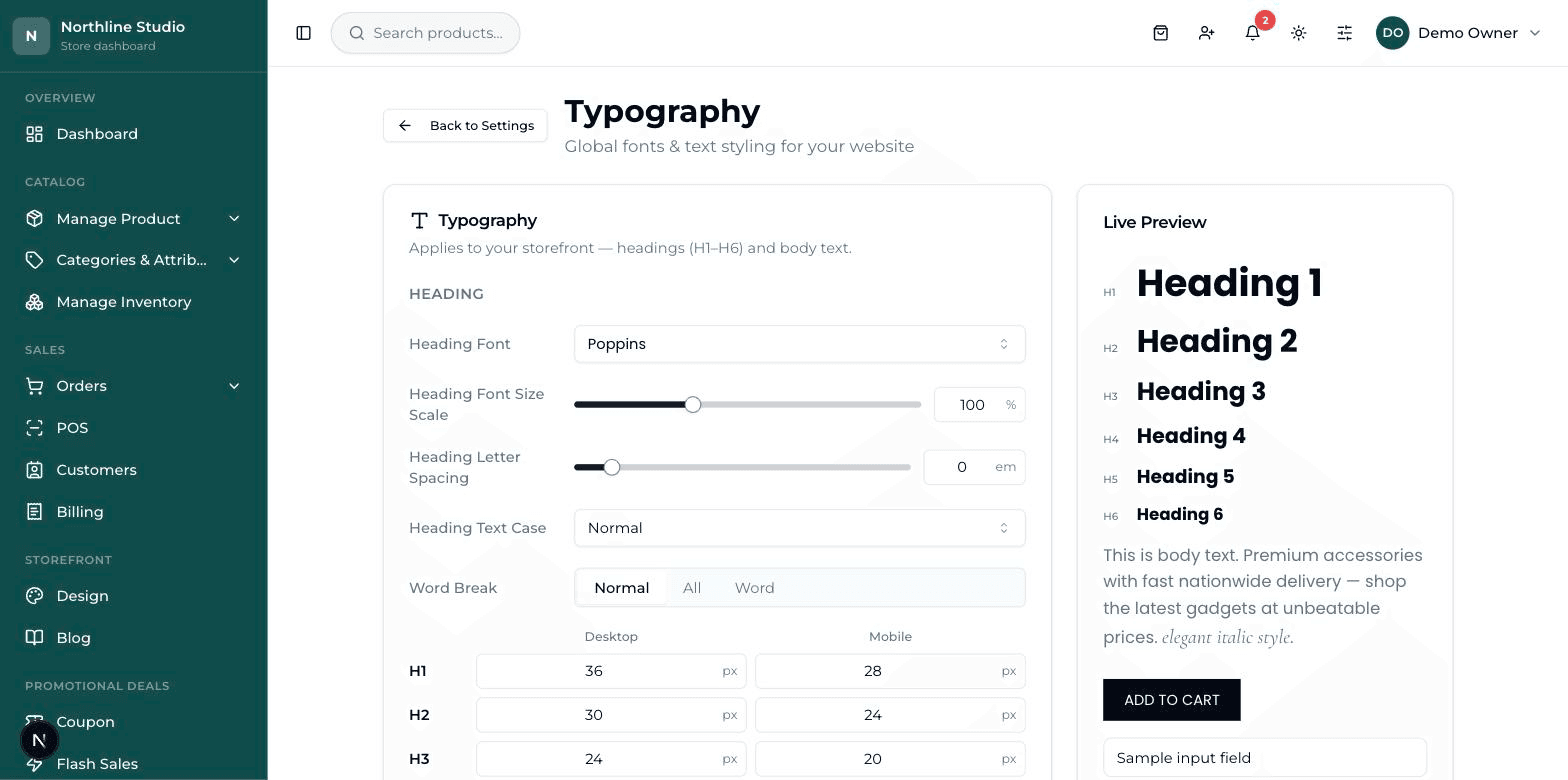
Typography means the lettering: which font is used, how big the headings are, how heavy the letters look. There is a Live Preview on this screen too, so you can see the effect before you save.
- Heading Font and Body Font — the lettering for the big titles and for ordinary writing. Two different fonts is plenty; three starts to look messy.
- Heading Font Size Scale and Body Font Size Scale — how big everything is. This is a scale, so it moves all the sizes together.
- Heading Weight and Body Weight — how thick the letters are.
- Heading Color and Body Text Color — the colour of the writing itself.
- Button Shape and Input Shape — Squared, Rounded or Full. Full makes buttons and boxes fully round-ended, like a pill.
Press Save Settings when you are done. Reset puts everything back the way it opened, if you have wandered too far.
Navigation — the menu at the top#
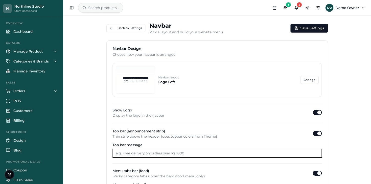
This screen, headed Navbar, does two jobs: it decides how the top band is arranged, and it holds the links in your menu.
In the card headed Navbar Design, press Change to pick the arrangement:
- Logo Left — logo, then the menu, then the icons. The usual and the safest.
- Logo Center — menu, then the logo in the middle, then the icons.
- Split Menu — half the menu, then the logo, then the other half.
- Stacked — logo on top with the menu on a line below it.
- Food (menu below) — logo and icons only, with no links up top. Made for food shops, where a menu bar sits under the banner instead.
The announcement strip#
- Top bar (announcement strip) — switch it on and a thin coloured band appears right at the very top of the website.
- Top bar message — what it says. It is the one line every visitor sees first, so keep it short and worth reading.
The menu links#
- Scroll to the card headed Menu Links. Each row is one link in your menu.
- The dropdown on the left of each row lists your real pages. Pick one and the label and the address fill in on their own — no typing.
- The middle box is what the customer reads; change it if you want a different wording.
- Use the small arrows on the left of a row to move it up or down. The order here is the order across your website.
- The switch turns a link off without deleting it. The red bin removes it for good.
- Press Add menu item to make a new row, then Save Settings at the top.
The Footer builder#
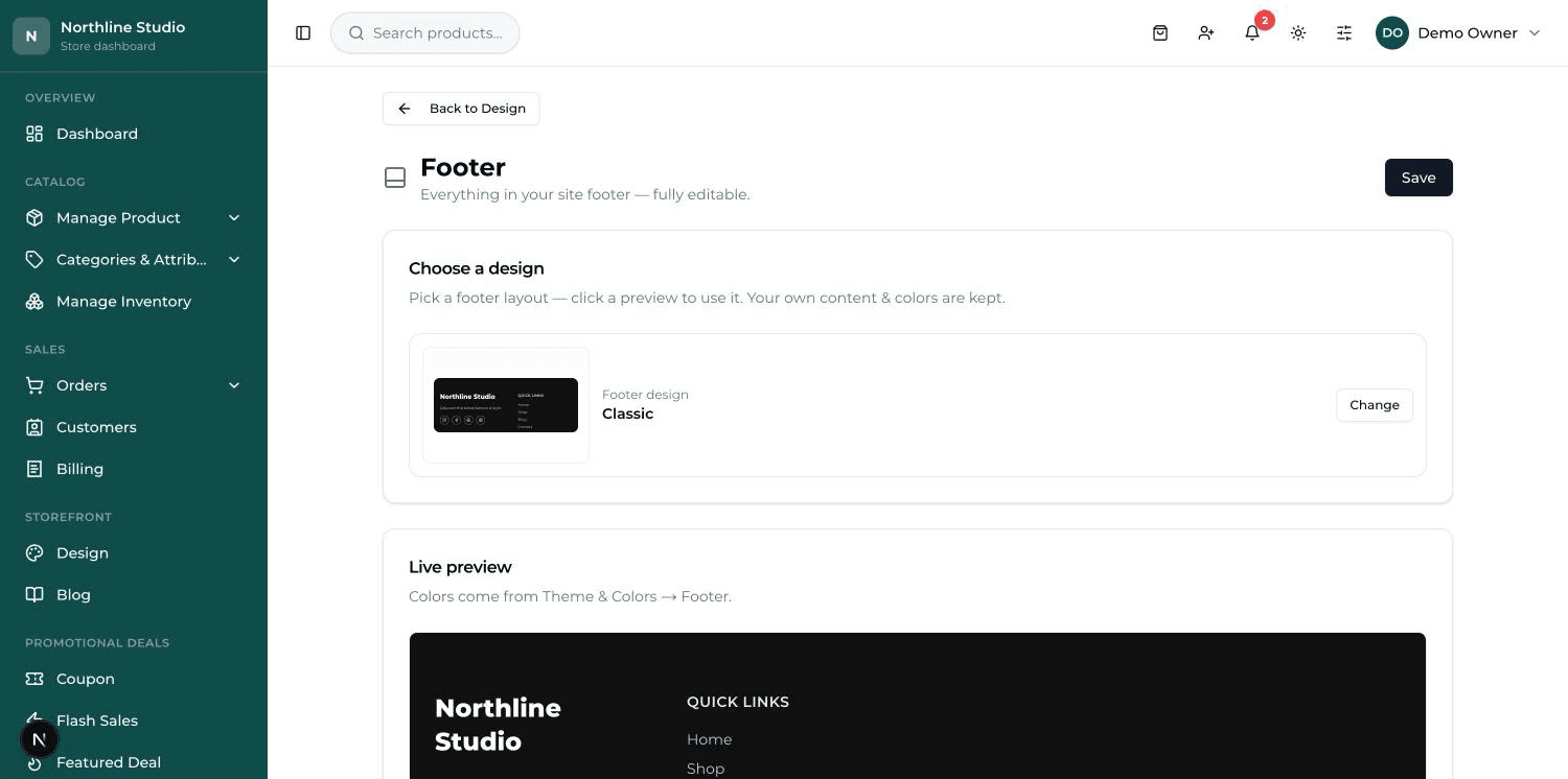
The footer is the strip at the bottom of every page. It matters more than it looks: it is where a customer goes when they are deciding whether to trust you. A real address and a real phone number do more work there than anything else.
The screen is a stack of cards. Fill in the ones you need and leave the rest.
| Card | What goes in it |
|---|---|
| Choose a design | The footer's arrangement — press Change to look through them. Your own text and colours are kept whichever you pick. |
| Live preview | Your real footer, updating as you type. Its colours come from Theme & Colors. |
| Brand | Footer logo, a Tagline under it, a Bold line, and a Feature image if the design uses one. |
| Contact | Phone, Email, Address, plus switches for Show opening hours and Show map. |
| Link columns | Groups of links with a title above them — Quick Links, Services, and so on. |
| Social links | Your Facebook, Instagram and the rest. The Show switch turns the whole row off. |
| Newsletter | A sign-up box, if the design you chose has one. |
| Call-to-action button | One button in the footer — its wording and where it goes. |
| Bottom bar | The copyright line right at the bottom. |